Research background
Senior Americans over the age of 65 are severely underrepresented in technology and modern information. For instance, around a third of internet users over the age of 65 describe themselves as ‘little or not at all confident’ in their ability to use computers, smartphones, or other devices to do necessary online activities [1]. With these seniors representing nearly 16% of America’s population and more citizens joining this age bracket, the situation is becoming more worrisome.
As community centers and family visits remain restricted due to the pandemic, more and more seniors are having to rely on video calls to connect with their loved ones. However, this activity is proving to be a giant challenge for senior citizens. Through 2020, the demand for senior tech classes nearly doubled [2].

This case study attempts to tackle one aspect of this complex issue by investigating the usability of one of the most prominent communication platforms today: Zoom.
Key Findings
I went into the study thinking that Zoom would need a design overhaul or a separate UI for seniors. However, seniors had a very positive opinion on zoom, with all four seniors rating the platform 8 out of 10 and above. Seniors did not have visibility issues with Zoom (ie. button sizes)– instead, they were much more concerned with trying to understand what a button or a feature does. One participant said that, even with weekly calls, it took her group of senior friends a whopping three months to get accustomed to Zoom.
In addition, seniors typically receive technical assistance through their family members. They rarely use the internet to troubleshoot— in fact, senior participants did not have a strong understanding of a web browser and its search capabilities. Seniors therefore much preferred personalized and in-person help over learning through an online resource.
- Most seniors understand the general concept of Zoom. Just like many other users, their primary objectives are to get in and out of a call.
- The UI layout of the video call platform is always different on every platform (Zoom, FaceTime, Skype, etc.), creating an extra topic for the seniors to get acquainted with.
- There are too many complex and auxiliary features on Zoom. Most seniors in our study would rarely use them (features such as ‘reaction’ or ‘record’ or ‘share screen’ or ‘security’). This caused even more cognitive load on the users who were already struggling to understand the primary features of the UI, such as turning on the camera.
- Non-layman terminologies throughout the interface were too confusing for seniors. For example, the ‘leave’ button was confusing to some participants because they were not familiar with the conference call term ‘leaving’. They rather associated ‘leave’ with colloquial phrases, such as ‘leaving a message’ or ‘leaving a voicemail’.
- Most seniors understand the general concept of Zoom. Just like many other users, their primary objectives are to get in and out of a call.

UXR-wise:
- I learned how to design and carry out a one-on-two interview/usability study.
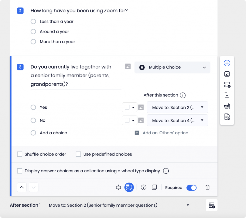
- I learned how to create extremely effective screeners. My screener was able to automatically filter out 532 applicants out of 560.
- I learned how to design and carry out a one-on-two interview/usability study.
Research Goals
This study focuses on goals:
- Learn how seniors interact with technology and video calling platforms
- Understand where seniors are having the most difficulty on Zoom
- Learn how seniors interact with technology and video calling platforms
Research Questions
- What are some barriers that seniors face in accessing technology?
- Do the barriers derive from the device design or the platforms within the devices?
- How do they navigate themselves in today’s essential platforms such as Zoom?
- What are some barriers that seniors face in accessing technology?
Recruitment via methinks Network
I recruited 4 US-residing seniors over the age of 65. To account for the potential technical issues, I indirectly recruited this group by creating a recruitment screener that targets adults between the age of 18 to 40 who currently reside with their parents or grandparents. These younger participants (assistants) were also asked in the screener if their senior family members would be willing to participate in a video usability test as the younger participants assist them with setup if needed.

We chose senior participants who stated that they had minimum experience with Zoom. To reduce bias, the assistants were also directed not to provide any training regarding Zoom before the usability test.
In-person technical assistance was seen to be crucial for this study to maintain control across the study sample size. In addition, due to the pandemic, it was a requirement that the younger participant resided with their senior family member.

Methods
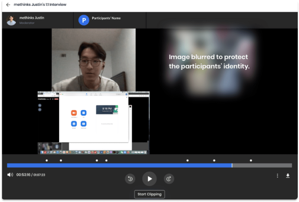
Four 1-hour interviews were conducted. The study was conducted with four seniors between the ages of 65 to 78. They were accompanied by one of their family members, mostly in their 20s and 30s. The interview consisted of:
- Introduction of the study and consent for recording the session.
- In-depth interview (IDI) portion where I asked about the seniors’ tech usage behaviors.
- Moderated usability test with the basic Zoom features such as signing up, joining and starting a call, and adjusting audio/video settings.
- A wrap-up with the seniors on their final thoughts on Zoom.
Each family participant was compensated for their time.
The interview recordings were qualitatively thematically analyzed.

Key Results and Findings
IDI — Tech usage behavior
- Most seniors conducted very few and specific activities with their devices, such as only using their devices to access data for their work and video calling. Most seniors had a minimal understanding and interaction with the internet outside of those few purposes. All four participants had at least one experience with Zoom.
- Because they are not familiar with the device and the internet, seniors typically resort to in-person help for technical issues. None of the four seniors stated that they use the internet as a primary resource for troubleshooting (which is a problem on its own).
- Participants stated that they have been relying more on video call platforms to communicate with friends and family since the pandemic. However, they typically do not initiate these video calls and instead join by invitation. Some participants addressed the desire to initiate the video calls but simply didn’t know how to.
- Senior participants typically did not use Zoom’s ‘schedule’ function. If they were making a call room, they mostly created the room right before the occasion, similar in concept to simply calling on the phone.

Usability Test
Participants had issues with entering a call. When seniors were asked to enter a pre-made call using Zoom’s Room ID/Password combination, they struggled with entering the long code into the boxes. Entering the call via URL link was not tested for this study.
The visibility of Zoom’s UI was not an issue. The issues of using the correct terminology that is layman enough for non-users to understand. This was especially true if the participant had English as their second language– regardless of the translation, the terminologies were not clear enough for them to understand the function of the buttons. This forces them to ‘figure out which button does what’, primarily by trial and error.
- For example, one participant thought that ‘sharing screen’ meant “sharing screen” with another person, as in sharing each others’ faces on the screen.
- Indirect terms such as “start video” and “leave” were unclear to some participants.
- There is no clear ‘invite’ button on the UI.

Senior participants felt that additional features such as sharing screens or sending reaction emojis were irrelevant to them. They simply want to use Zoom to call their friends and family or their workplace.
Both seniors and their younger family members struggled with Zoom’s invitation feature.
- There is no clear ‘invite’ button on the main Call UI. Participants had to either click on ‘participants’ to find the invite link or click on the green ‘security’ logo on the top left of the Call UI.
- The concept of having two separate methods of inviting someone to a call (either by a URL link or code entry) was confusing to seniors.
Recommendations/Discussion
Use clearer terms
- Reduce the trial-and-error issues of figuring out Zoom by directly naming the functionalities of each button. For example:
a. Change ‘Start video’ to ‘turn on my camera’.
b. Change ‘Leave’ to ‘hang up’ or ‘leave the call’.
c. Include an ‘Invite’ button that is visible on the main call UI without clicking on the drop-down. - Additional study is required to understand which terminology would best represent the functionality of each button.
Simplify invitation
- Both senior participants and their younger family members struggled to enter the Room ID and password incorrectly. Simplifying the invitation process by only having a URL link would reduce cognitive load for users.

Justin Kim
Justin is a UX Researcher at methinks. He has administered hundreds of interviews with methinks Thinkers on behalf of methinks customers. And, he talks with consulting and in-house qualitative research experts every day. His primary role is advising researchers on survey and interview structure and process, providing outstanding counsel on creating objective results and listening.
